


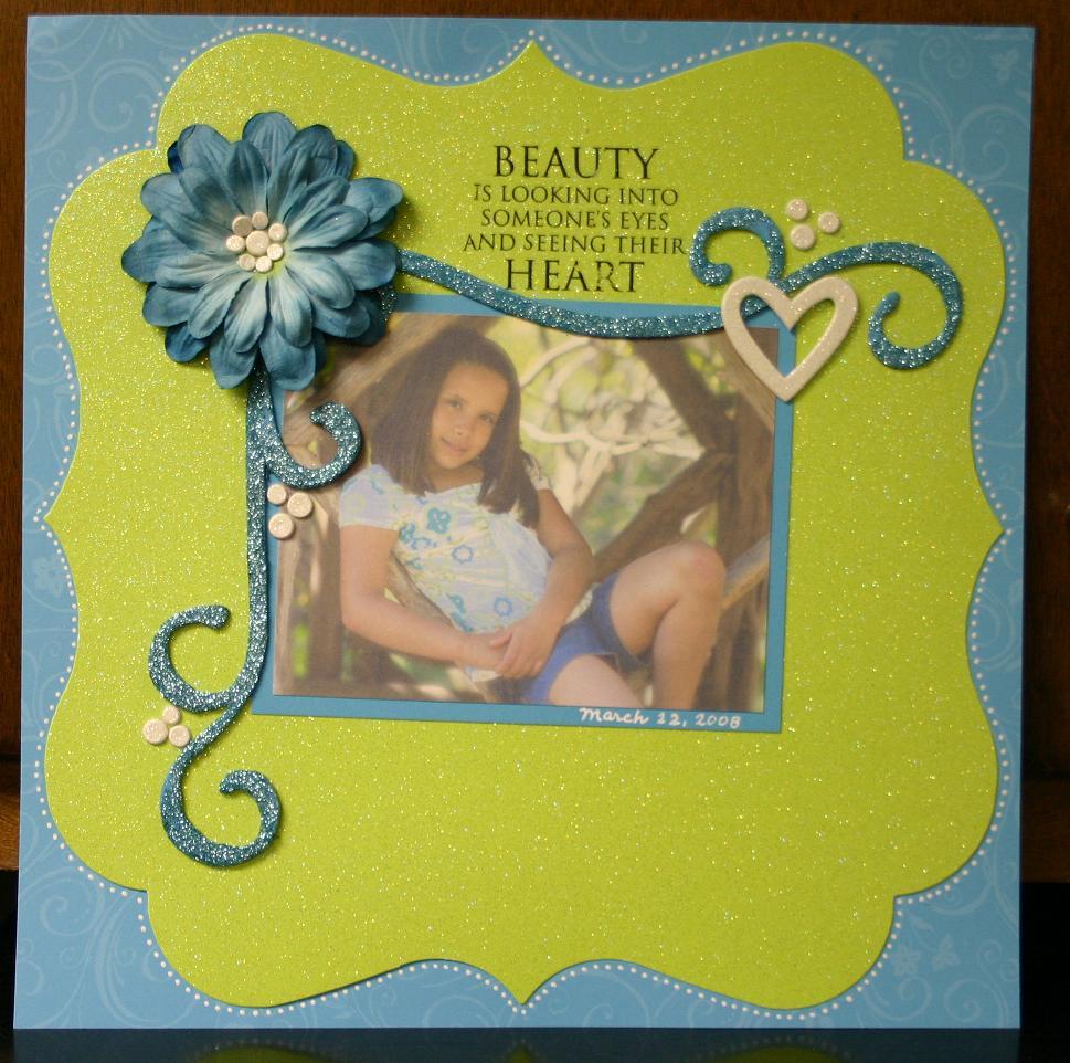
I loved the colors of the Coldwater Creek skirt Beate chose for this week’s inspiration piece, and thought they’d be perfect for a scrapbook page highlighting this picture I took of Adri on Saturday. This kids and I (along with my nephew) spent the morning at the McNay museum, taking pictures and having fun looking at the sculptures and water features. Good times.
Since I started late at night, and had to leave early. . . I feel like this is unfinished. I know I need something in the lower right, but what? I applied a rub-on to the glitter paper, and BLECH. . . if everything hadn’t already been adhered and stuck SOLID to the glitter paper I paid like $2.50 for, I would have trashed the page. As it is, I had to fix a couple of the letters with a black marker! What do you think? What does it *need*? I’ll take your suggestions and re-post later this evening.
Details: Base is turquoise Palette of Prints from SU!, green glittered cardstock is Doodlebug, and was die cut at my local scrapbook store. Swirly chipboard is from Fancy Pants and was covered in turquoise paint and then dipped in Martha Stewart turquoise glitter. Big flower is a bunch of different Primas from one of the buckets I’ve had on my shelf forever. White chipboard was pre-glittered and is also Doodlebug. Beauty rub-on, I believe, is from Daisy D’s. And. . . ’cause it needed something (it’s always something, isn’t it?), I added little dots all around with my white gel pen.
Make sure to wander over and visit Beate, Charmaine, Danielle, Dawn, Silke, and Susan to see how they were inspired by the long, flowy skirt. I can’t wait to see what they’ve done!
23 Comments
GORGEOUS, Jenn! LOVE the sparkles! What a great page!
I think it’s gorgeous! Love the flower, the sparkling matboard and all those dots! I am not sure what you could put in that corner. It might take away from the rest.
i think it is great as it is!
Wow! This is very very pretty, I love all the bling. Gorgeous.
I think you’re right – just a little something to balance it out. I would try for a small heart and some of those little cream dots – not sure if they are brads or chipboard….
Hi Jen! This is a beautiful page, even though you’re not feeling it! What about adding some words right underneath the picture (medium sized chipboard letters like Thickers by American Craft)? Something like “I love this girl”. Start the letters about an inch from the left of the photo, and let them go past the photo on the right at least an inch. Then just below the last letter at the far right, add a few more flowers.
I think black would be best because it then ties in the black from the sentiment above the picture and brings it somewhere else on the page besides there.
Hope this helps and spurs more ideas for you!
Hugs,
Amy
My idea was to suggest some handwritten journaling similar to Amy’s idea – but I absolutely love this page, and did you handcut the gold paper – that is just beautiful! The flourishes and sentiment are also amazing – I think it is a wonderful page!!
Cute, Girly! I love that die-cut green cardstock! Wouldn’t you love a whole stack of that in every color?! LOL!
Happy Tuesday!
I love it as is. Really gorgeous.
Hi Jenn! I thought the page was beautiful and didn’t occur to me that it “needed” something……until you put the idea in my head! ha ha! IF you just HAD to add something else, I would try maybe just a cluster of 2 or 3 smaller flowers like you have in the upper left. Or maybe just one small flower with one of the smaller hearts? I think it’s gorgeous as is though!
Jenn–this is gorgeous…I LOVE the glitter paper and the framing of that awesome photo.
I love it. I don’t think it NEEDS anything but if you wanted to add anything I think a larger heart (like the one in the top right corner) by the bottom of the swirl on the left would do it. I love how the right side is open.
GREAT Page!
Gorgeous layout and colors! Your daughter is gorgeous and is a spitting image of you!
Jenn this is GORGEOUS! And I love the sparkle. But what absolutely makes it for me is the addition of the gel pen dots all around the green.. such a PERFECT detail and beautifully done. If you have another swirly glitter thing maybe try just a small part of it on the green cardstock to sorta match the single swirl that comes down from behind the flower to give an illusion of a complete ‘frame’ around the photo. And maybe add a couple of the small chipboard dots with it? But honestly it really feels balanced to me now and anything more might detract away from the beautiful centerpiece (photo).
GORGEOUS page, Jenn, as is!
Wonderful page – I can see your love for her shining through. Before you mentioned it I wouldn’t have said it needed something else, but then I started looking at it more and I think you could go either way. Maybe you could add two small flowers down there or a flower and a circle punch of another picture of her.
This is beautiful as is, but I could see adding her name in a coordinating paper in the bottom right with a couple of the cream heart accents or flowers to anchor it….love it!
Gorgeous page!!! I love everything about it!!!
Jenn, this is beautiful. It doesn’t really ‘need’ anything. I really like it as is. I think if you add anything, it should be very subtle, maybe in the same green paper — a row of dots just below the picture, or echoing the curve of the frame.
I think it looks fine the way it is, but if you really want something there how about having Adri write her name on a coordinating paper? Or on the glitter if that is possible.
(I just found your blog today and I really love this layout — I especially love that you did something different from a card for the challenge!!)
I’m loving the page as it is and the little white dots all around the glittered paper really make the page pop!!! I didn’t think anything was missing until you said something but maybe just a few of the little glittered circles in a line under the date. Just enough to draw your eye from the top flower, past the picture and then to the bottom… sorta like reading a page of a book if that makes sense. 🙂
My first thought was “it needs journaling.” Maybe on a scrap of vellum, slightly tucked under the photo mat, and cock-eyed a bit. Just a few words saying basically what you wrote in your blog post would be enough, I think. And you could underline one or two words in blue glitter. That’d be cute.
It’s a great page! And that glitter paper looks awesome with the blue. 😀
Well I usually find that I really need balance on my projects, but in this case I really don’t think it needs anything more. It’s a great photo and you don’t want to take anything away from it. I think I read somewhere about some empty space to rest the eyes or something like that!
This is wonderful. I love the colours and the glitter. Joan
Oh my goodness…this is beautiful! I love the big flower,sparkles and die-cuts, and of course the photo is darling!!
One Trackback
[…] Jenn Balcer […]